Stop sending your traffic to Zillow: the business case for custom IDX home search
Buyers default to the portals because most agent sites have a terrible home search. What a custom IDX search changes about retention and lead ownership.

Every agent knows the shape of this problem. You spend weeks building a relationship with a buyer, they browse homes on Zillow or Redfin one evening, they click an ad, and a competing agent picks up the call.
The question worth asking is why buyers default to a portal at all when they already have your website. The answer is usually not loyalty. It is that searching for homes on most agent websites is genuinely unpleasant.
IDX has been treated as an afterthought for a decade
For years the site builders serving this industry treated IDX, the Internet Data Exchange feed that puts MLS listings on your domain, as a box to tick rather than a product to design. What that produced is the iframe widget: a slow, non-responsive panel dropped into the middle of a page, styled by someone else, behaving like software from 2010.
A buyer does not evaluate that widget on its technical merits. They tap a filter, wait, watch the layout jump, and open the app that does not make them wait. If searching on your site is frustrating, your client will leave, and the visit you paid for turns into a lead for whoever bought the ad slot next to the listing.
Your home search is not a feature on your website. For a buyer in the browsing phase, it is the website.
What a good home search actually looks like
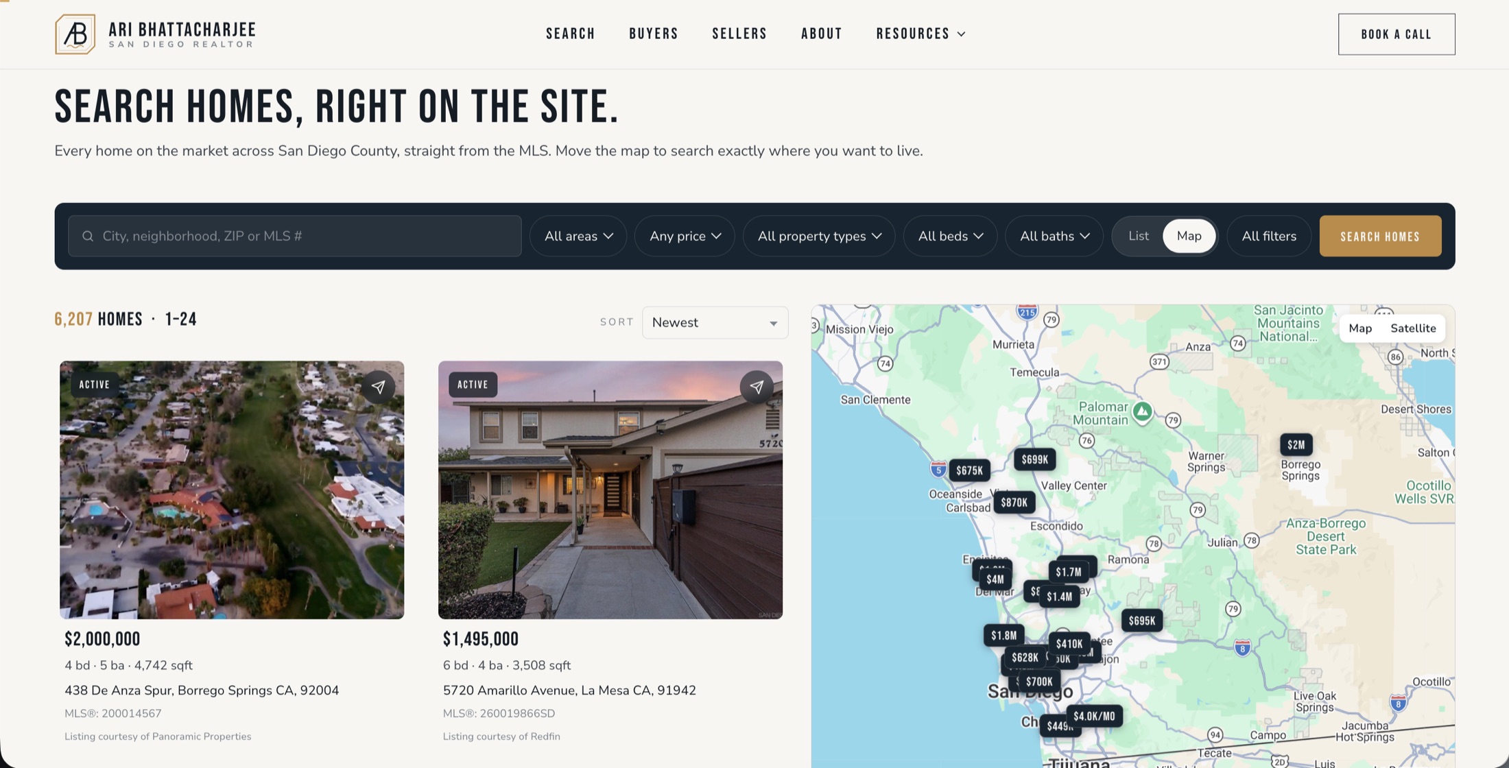
The clearest benchmark we can point at is one we built. Ari Bhattacharjee is a San Diego agent whose search page runs on the same custom stack we are describing here, and it is worth walking through what the interface is doing, because none of it is exotic.
1. Map first, with both views at once
The interface holds an interactive map alongside high resolution property cards rather than making you choose between them. Buyers are answering two questions simultaneously, what does this house cost and where exactly does it sit relative to the highway, the park, and the school boundary. Splitting those into separate screens doubles the work.
2. Property cards that are not data dumps
Each card leads with the five things that decide whether a buyer clicks: price, address, beds, baths, and square footage, plus a status tag for active, pending, or new. Everything else waits for the detail page. The typography and spacing are borrowed from consumer app design rather than from MLS software, which is why it scans in a second.
3. Filters that live at the top and never reload the page
Price, property type, and keyword filtering sit in a bar across the top and apply in place. No multi step form, no full page reload, no losing your scroll position. The cost of narrowing a search is close to zero, so buyers narrow it repeatedly instead of giving up on the second attempt.
4. No competitor ads, because it is your house
This is the part the portals structurally cannot match. Their listing pages carry ads for lenders and for other agents, because that is the business model. A search running on your own domain keeps every pixel pointed at you, and every saved search, favorited property, and tour request lands in your inbox rather than in an auction.
The flywheel this creates
The individual design decisions above are small. What makes them worth paying for is the loop they close, where each step feeds the next.
- 1
Fast map search means a buyer gets an answer in under a second, so the first interaction does not cost them anything.
- 2
Clean cards and instant filters make narrowing the field feel cheap, so they run five searches instead of one.
- 3
High time on site follows from that, and dwell time is both a genuine ranking signal and the mechanism by which your brand becomes familiar.
- 4
Frictionless lead capture arrives naturally, because a buyer who has run five searches has a real reason to save one, and saving requires an account.
- 5
Exclusive agent retention is the payoff. The saved search lives on your domain, the alerts come from you, and there is no competing agent in the margin.
Three business outcomes, stated plainly
It is worth being specific about what a custom search returns, because the argument is often made in vague terms about user experience.
The first is dwell time. When search is fast and pleasant, buyers stay for ten, twenty, or thirty minutes at a stretch rather than bouncing in forty seconds. That lifts how the domain performs in search, and more importantly it is how someone comes to think of your site as the place they look.
The second is lead ownership, which is the one that actually pays. When a buyer saves a search or creates an account on your website, you own the verified contact details and the criteria. You can see which homes they opened last night. A follow up call informed by that is a different conversation from a cold check in.
The third is credibility. Offering a search that holds up against a national app tells a buyer, without you saying anything, that your business operates at that level. The inverse also lands, and it lands quietly.
Design and search are the same decision
The reason most IDX implementations fail is that they are treated as an integration rather than as part of the design. A search tool should not look like a third party product parked inside your website. It should carry your typefaces, your spacing, your colors, and your photography, so that moving from your neighborhood page into your search feels like one continuous place rather than a handoff to a vendor.
That is the whole argument. The portals win the search habit by default, and the only way to take any of it back is to make the search on your own domain better than the alternative, not merely present on it.