
The silent exit: why high-net-worth home buyers leave real estate websites in 10 seconds, and how custom UX keeps them
Affluent buyers do not complain about a clumsy website. They leave without a word. The three design decisions that send them away, and what to build in their place.


Why do luxury real estate websites suffer from high bounce rates?
Luxury real estate websites lose visitors when they put friction in front of the property. The usual causes are a registration pop-up that appears before any photos, galleries that load slowly because the images were never compressed, a home search that runs inside a third-party widget, and a template layout that looks like every other agent's site. A buyer shopping above $1.5M decides in the first few seconds whether a site matches the level of the homes on it, and if it does not, they leave without contacting anyone.
When an affluent buyer lands on a real estate website that falls short, they do not send feedback. They do not fill in the form to say the form was annoying. They close the tab. We call this the silent exit, because the only trace it leaves is a short visit in your analytics.
A first-time buyer hunting for entry-level inventory will often put up with a slow page or a clumsy form, because the listing is what they came for. A high-net-worth buyer has spent years with brands like Porsche, Apple, and Net-a-Porter, and they hold your site to that standard. A full-screen sign-up box five seconds into a listing, or a search that opens in a slow embedded window, is enough to send them back to Zillow or to a competitor.
Template friction against a custom build
| Generic template | Custom luxury build | |
|---|---|---|
| First photo | Behind a mandatory sign-up | Open, with nothing in the way |
| Gallery | A slow slider of oversized files | Compressed modern formats that appear at once |
| Getting in touch | A generic contact box | Tour scheduling tied to the home on screen |
| Home search | A third-party window on another domain | Native search on the agent's own domain |
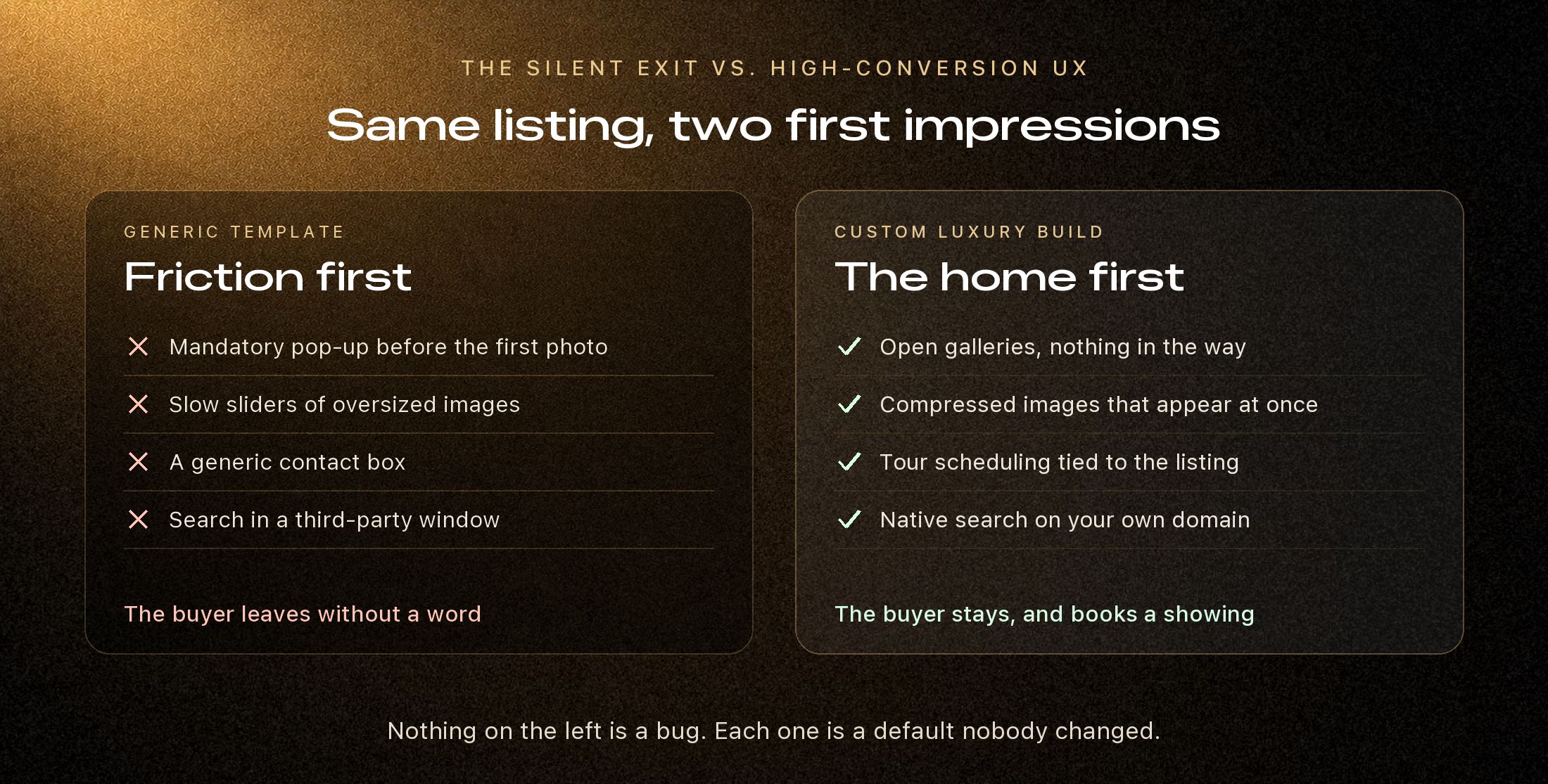
The three UX flaws behind most silent exits
- 1
Forced gatekeeping. Nothing loses a wealthy buyer's trust faster than demanding an email address before they can see photos or a floor plan. We design value-first flows instead: let the visitor look freely, then offer something worth signing up for, such as off-market property alerts or a custom neighborhood valuation report.
- 2
Visual clutter and weak type hierarchy. Property details crammed into tight tables in mismatched fonts read as careless. Luxury design depends on generous white space, full-width photography, and clear editorial typography that lets the property speak for itself.
- 3
Third-party search windows. When a buyer clicks a listing and the address bar changes to a generic portal domain, the sense of a private, considered brand is gone. Native search keeps every listing on your own domain. Ari Bhattacharjee's San Diego site, aribrealty.com, runs its full home search this way.
A buyer who leaves quietly does not tell you why. The design has to answer the question before they ask it.
Designing for high-trust micro-conversions
Keeping an affluent buyer on the site does not mean removing every ask. It means replacing the one large demand with several small, well-timed ones.
- One-tap tour scheduling. A sticky action bar lets a buyer request a private video or in-person showing without leaving the photo gallery.
- Neighborhood context beside the listing. Local detail such as schools, dining, and commute sits next to the property rather than on a separate page. Mesaynish Wodajo's Dallas site does this with dedicated guides to Addison, Richardson, Irving, and Celina.
- A fast, personal first reply. Every inquiry is answered by text within about 30 seconds, so a showing is on the calendar before the buyer moves on to another site.
3
UX flaws behind most silent exits
0
Forms between a visitor and the first photo
1
Tap to request a private showing
Turning trust into listings
Your website is the one storefront that is open all day, every day. When it is free of friction and looks the part, it does more than keep buyers browsing. It shows local sellers how their own high-value home would be presented, which is often what decides who gets the listing appointment.
Clozma designs custom sites for agents who sell at the top of their market, with open galleries, native search, and tour scheduling built into the listing. See the sites we have built.