80% of buyers open your website on a phone: why mobile UX is the real test of real estate web design
Most agent websites are designed on a laptop and lived on a phone. What changes when you design for the thumb first and let the desktop layout follow from it.


More than eight in ten visits to a real estate website arrive on a phone. That number is worth sitting with, because it inverts how most of these sites are actually made.
Think about when people look. A buyer in the back of a rideshare. Someone parked outside an open house fifteen minutes early. A couple in bed at eleven at night, passing a phone back and forth. None of them are opening a laptop. Every one of them is meeting your brand on a screen about six inches tall.
Responsive is not the same thing as mobile first
Nearly every agent site today is technically responsive. The layout reflows, nothing overlaps, the text stays readable. That clears a low bar, and it is not the same as being designed for a phone.
Responsive usually means a desktop design was made first and then compressed until it fit. The decisions, which is to say the hierarchy, the size of the hero, the placement of the call to action, were all made against a wide screen and a mouse. Shrinking that down keeps the content and loses the reasoning behind it.
| Designed on a laptop | Designed for a thumb | |
|---|---|---|
| The hero | An autoplaying video header that stalls on a cellular connection | One fast image that paints immediately and holds the room |
| Actions | Small targets spaced for a cursor that never misses | Full width targets in the lower third, where a thumb already rests |
| Lead capture | A full screen popup two seconds after landing, with a tiny close button | A persistent call and text bar that never covers what is being read |
| Listings | A wide comparison table folded into a single column | Vertical swipe cards that behave the way every other app does |
Three flaws that quietly cost you the lead
1. A hero that will not paint
Mobile connections vary enormously, and the heaviest thing on most agent homepages sits at the very top. A large video header or an image slider means the visitor watches an empty rectangle while the page decides what to show them. Past roughly three seconds, a meaningful share of them are gone, and Google treats that slowness as a ranking signal in local results as well.
2. Anything that requires a pinch and a zoom
If a buyer has to spread two fingers to read a neighborhood description, open a search filter, or hit your phone number, the interface has failed. Tap targets need real physical size, roughly the width of an adult thumb, with enough space around them that the wrong one is hard to hit. This is unglamorous work and it is most of what mobile usability is.
3. The popup that arrives before the page does
A modal covering the whole screen two seconds after landing, before the visitor has seen anything worth trading an email for, is the single fastest way to send someone back to search results. On a phone it is worse than on a desktop, because it occupies everything and the close button is frequently too small to hit on the first try.
On a phone there is no margin. Every element is either helping the visitor get somewhere or standing in the way, and there is no room left over for anything else.
What designing for the thumb looks like
The alternative is not a stripped down site. It is a site whose important decisions were made against a phone first, with the desktop layout derived from that rather than the other way around.
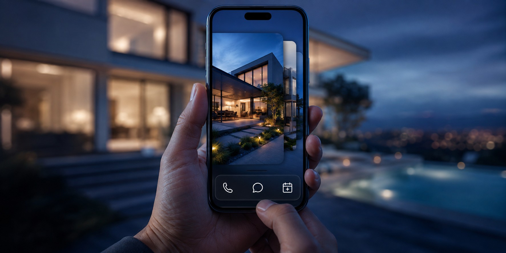
- A sticky action bar carrying call, text, and schedule a showing, pinned within thumb reach and sitting above the content rather than on top of it.
- Property galleries that swipe horizontally with the momentum people already expect, instead of arrow buttons built for a cursor.
- Form inputs simplified for a small screen, where a row of tappable options replaces a dropdown and the keyboard opens in the right mode for the field.
- A hero that is one optimized image, so the first meaningful paint happens almost immediately even on a weak connection.
80%+
Of real estate traffic arrives on a phone
3s
Before a mobile visitor starts leaving
44px
Minimum tap target size
The part that shows up in the business
When a site feels as quick and as considered as the consumer apps someone uses all day, the behavior changes in ways you can see in analytics. Sessions run longer. More listings get opened per visit. The contact rate rises, not because anything was made more persuasive, but because reaching out stopped being an obstacle course.
The reverse is also true and it is entirely silent. Nobody emails to say your mobile site was frustrating. They simply go back, tap the next result, and you never learn that they were there at all.