Beyond risk avoidance: how ADA compliance and WCAG 2.2 improve real estate website UX and search rankings
Most agents treat accessibility as a legal chore. The same standards that make a site usable for someone with a disability make it clearer, faster, and easier to rank.
Is ADA compliance required for real estate websites, and does it affect SEO?
In practice, yes. US courts and the Department of Justice have treated the websites of businesses that serve the public as covered by the Americans with Disabilities Act, and real estate sites are regularly named in accessibility claims. The ADA itself does not spell out a technical standard, so the Web Content Accessibility Guidelines, currently WCAG 2.2 at level AA, are the benchmark most settlements and audits use. Meeting them also helps search performance, because the same work, clear heading structure, descriptive image alt text, keyboard friendly controls, and readable contrast, makes a site easier for search engines and AI tools to understand.
This article is a design perspective, not legal advice. If you have received a demand letter, talk to an attorney before you talk to a web designer.
Thousands of web accessibility lawsuits are filed in the United States every year, and real estate is a frequent target, because an agent's website is plainly a service offered to the public. So most agents meet this topic as a threat: a list of technical fixes to make so nobody sues.
We think that framing undersells it. The standards that make a site usable for someone who cannot see the screen or cannot use a mouse are, almost line for line, the standards that make it better for everyone else.
Every requirement has a second benefit
| What WCAG 2.2 asks for | Who it is for | What everyone else gets |
|---|---|---|
| Text contrast of at least 4.5 to 1 | People with low vision | A page you can read on a phone in direct sunlight |
| Descriptive alt text on images | People using a screen reader | Listing photos that search engines can understand |
| Forms and filters that work by keyboard | People who cannot use a mouse | Cleaner autofill and fewer abandoned forms |
| A real heading structure | People navigating by headings | Content that AI answer engines can parse and quote |
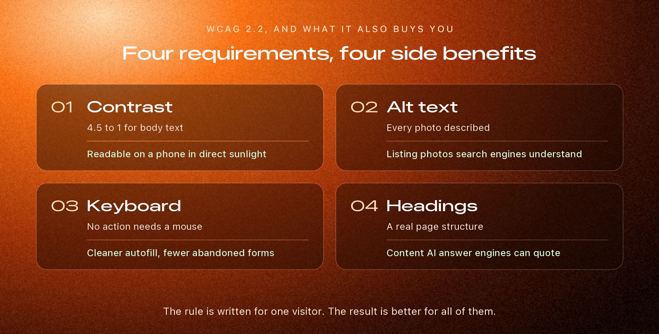
The four that matter most on an agent site
1. Alt text on property photos
A screen reader can only describe a photo if someone has written the description. Light filled kitchen with a quartz island and white oak cabinets tells a blind visitor what is in the room. It tells a search engine the same thing, which is how listing photos come to appear in image and visual search. IMG_4471 tells nobody anything.
2. Search filters that work without a mouse
Home search is where agent sites fail most often. Price sliders that can only be dragged, dropdowns that trap keyboard focus, and map pins that cannot be reached by tabbing lock out anyone using a keyboard, a switch, or voice control. WCAG 2.2 is explicit that anything operated by dragging needs a simple alternative, such as typing the number in.
3. Contrast you can actually read
Pale gray text on a white background looks refined in a design mockup and fails the 4.5 to 1 minimum for body text. It also fails every buyer standing on a driveway squinting at their phone. Strong contrast is the cheapest fix on this list, and often the one a visitor notices first.
4. Visible focus and generous tap targets
When someone tabs through a page, a clear outline has to show where they are. WCAG 2.2 added rules that the focused element must not be hidden behind a sticky header or a chat widget, and that tap targets should be at least 24 pixels across. On a phone we design well above that minimum, because a button that is hard to hit is hard to hit for everyone.
4.5:1
Minimum contrast for body text
24px
Minimum tap target in WCAG 2.2
0
Actions that should need a mouse
Why an overlay widget is not the answer
There is a category of product that promises compliance from one line of code: a floating button that adds a menu of contrast and font size toggles. It is tempting because it is fast. It does not fix the underlying page, and sites using these overlays are still named in lawsuits.
If a filter cannot be reached by keyboard, a toolbar floating over it does not change that. Accessibility lives in how the page is built, which is why it is much cheaper to design in from the start than to bolt on afterwards.
An accessible site is not a different site. It is the same site, built by someone who checked.
A five minute check of your own site
Put your mouse aside and press Tab from the top of your homepage. Can you see where you are at every step? Can you reach the search, change a filter, and submit a form? Then open a listing and check whether the photos have real descriptions. Finally, read your smallest text on your phone, outdoors.
That will not tell you everything an audit would, but it will tell you whether you have a problem, and nearly every site we are asked to look at fails at least one of the three.
How Clozma builds for it
We build accessibility into the structure of a site rather than adding it at the end: semantic markup, proper labels on every control, keyboard paths through the search, and color palettes checked for contrast before a page is designed around them. No one can honestly promise a site will never receive a complaint. What we can do is build one that holds up when it is tested, and reads better for every visitor in the meantime.