The five minute window: how web design captures real estate leads before they go cold
Speed to lead gets treated as a CRM problem. It starts earlier than that, in the form design that decides whether you ever get a name to respond to at all.


Sales research across industries keeps landing on the same finding. Reaching a web lead within five minutes makes you dramatically likelier to convert them, on the order of twenty times better than a reply that arrives half an hour later. In real estate, where a buyer is often comparing three agents in one evening, the window is if anything tighter.
So speed to lead gets treated as an operations problem. Better notifications, a faster CRM, a discipline about answering the phone. All of that is worth doing. None of it helps with the visitor who never became a lead in the first place, and that is where most of the loss actually happens.
The lead you never got cannot be called quickly
Consider what a standard agent website asks of someone who just wants to know whether a listing has a finished basement. Full name. Email. Phone. Preferred contact method. Price range. Timeline. Are you working with an agent. A message box. Then a submit button that reads Submit.
That form is not collecting information. It is running a qualification interview before it has offered anything in return, and most people close the tab rather than sit through it. The five minute clock never starts, because there was nothing to respond to.
5 min
The window where most conversions are decided
21x
Likelier to convert inside it than after 30 minutes
1
Field a first step should be asking for
The three stages a converting page actually has
A page that turns traffic into conversations tends to be doing three distinct jobs in sequence, and it is worth separating them, because most sites do the first one and skip the other two.
| Stage | What the visitor meets | What it has to accomplish |
|---|---|---|
| Arrival | A hero that loads immediately and looks expensive | Establish, in about one second, that this is a real business worth talking to |
| The small ask | One input that returns something useful on its own | Trade value first, so the second question feels earned rather than demanded |
| The handoff | A confirmation, while the alert is already on your phone | Start the five minute clock the moment the visitor is still on the page |
What high converting design does differently
1. Two step valuations instead of one long form
Rather than asking a homeowner for their name, email, phone, address, and property condition on one screen, the first step asks for one thing: the address, to show recent sales nearby. That is a fair trade, and it is a single input, so people complete it.
Contact details come on step two, after the visitor has already invested an action and received something for it. The conversion difference between these two versions of the same form is not marginal. It is the difference between a page that produces leads and one that produces traffic.
2. Calls to action that name the thing being offered
Submit and Send Message describe what the button does for the website. They say nothing about what the visitor receives. Replace them with the actual offer, phrased the way the visitor would say it. Get the Frisco relocation guide. Schedule a private video tour. See this quarter's builder incentives.
This is close to free to implement and it consistently moves numbers, because it changes the question from whether to fill out a form into whether to accept something specific.
3. Routing that beats the visitor to the door
When a form is submitted on a site we build, the details go to your phone and into your CRM in the same moment, with the context attached: which listing, which page, which search. You are not learning about the inquiry at the end of the day. You are able to respond while the person is still on the page they submitted from.
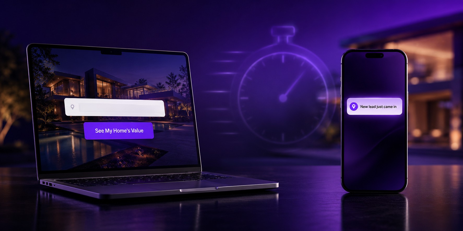
Speed to lead is decided by the form, not by the follow up. A form nobody finishes is a five minute window that never opens.
Design is what earns the right to ask
There is an uncomfortable fact underneath all of this. People do not hand their phone number to a website that looks improvised. Handing over contact details is a small act of trust, and the visitor decides whether to extend it based on the only evidence available, which is how the page looks and how quickly it responded.
A clean, fast, considered site reads as a real business with something to protect. That impression is doing conversion work before a single field has been filled in, and no amount of clever copy on the form recovers it once it is lost.
Where to start
If your traffic is healthy and your inquiries are not, the problem is almost never the volume. Count the fields on your main form, read your button labels out loud, and time how long an alert takes to reach your phone. Those three checks usually explain the gap, and all three are design decisions rather than marketing spend.